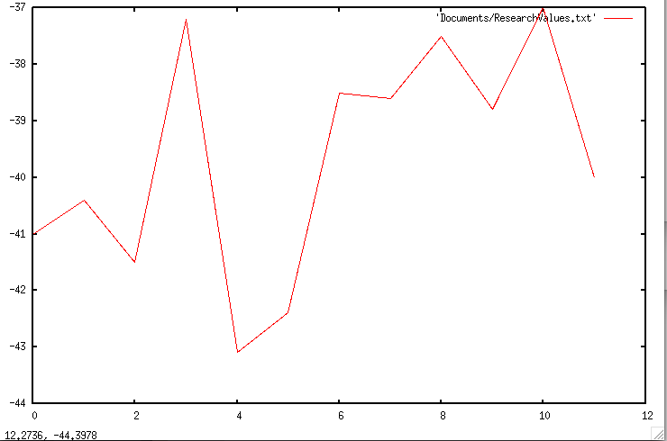
This week I configured and installed GNUPlot so that I can create comprehensive graphs of my results. My first graph, which shows how the global ∆G changes with local modifications with a window size of 100 and a threshold > 0.1, is shown below. However, it does not only show the changes that were advantageous, but also the changes that were't kept (or used towards optimization).
 RSS Feed
