This week I performed more extensive testing and generated results using a sample FASTA file with a DNA sequence as input and my program as output. The results, shown below, are using an Rfold threshold of 0.1 and a window size of 100 nucleotides.
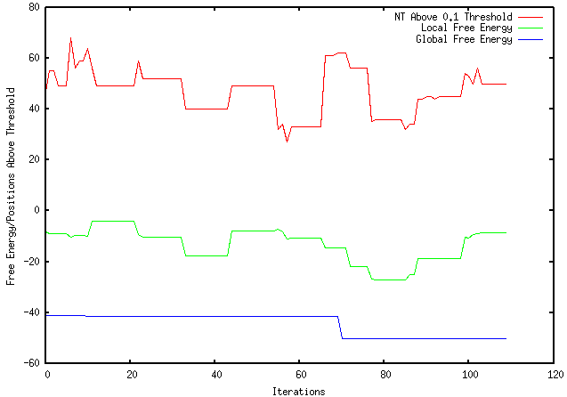
As shown, the top red line represent the number of nucleotides above the 0.1 threshold for each iteration. The middle green line represents the individual local folding energy for that 100-nucleotide sequence. The bottom blue line represents the global energy once the optimized local sequence was put back into the global sequence, which occurred after every 10 iterations. It should be noted that only the lowest global energy was kept, therefore, if there was an instance where the optimized local sequence increased the overall global energy, the lowest global energy from the previous iterations were kept.
I also learned many more features that GNUPlot offers. As you can see, I learned how to plot multiple lines on one graph, manipulate axis labels and scale, as well as label individual lines based on their representative identities.
I also learned many more features that GNUPlot offers. As you can see, I learned how to plot multiple lines on one graph, manipulate axis labels and scale, as well as label individual lines based on their representative identities.
 RSS Feed
